Brushstrokes and Bad Girls
There was a time—not so long ago in the grand scheme of things—when the cover of a paperback was as important as the words inside. Maybe even more. The right cover could make you pick up a book you’d never heard of by an author you wouldn’t trust in a dark alley. And nobody—and I mean nobody—knew how to play that game better than Robert McGinnis.
These guys can be bothered to do something great, so why not the big guys? I probably shouldn't be surprised. It’s the way things are everywhere. When was the last time you saw a fantastic album cover from a major label artist? Was it even this century? Anyway...
The Golden Hand Behind the Rack
Born in 1926 in Cincinnati, Ohio, McGinnis was already drawing before most kids could tie their shoes. After a stint in World War II, he studied at the Art Institute of Cincinnati, then went on to refine his craft at the Art Students League in New York. He wasn’t aiming to be a pulp legend—who was? At first, he was just another working artist taking on commercial illustration gigs: magazines, advertising, movie posters. But the call of the paperback was too strong.
His first big break came via a cover for a Mike Shayne novel in 1959. From there, it was like lighting a fuse on a stack of dynamite. Over the next few decades, he painted more than 1,200 paperback covers—and not just for nobodies, either. Donald Westlake, Carter Brown, Erle Stanley Gardner, Brett Halliday, Richard S. Prather... If your name was floating in the smoky atmosphere of crime and mystery fiction in the ’60s and ’70s, chances are you got the McGinnis treatment.
And what a treatment it was.
More Than Just Legs
Let’s address the elephant in the garter belt. McGinnis is often celebrated—but just as often, dismissed—for his women. Long-legged. Elegant. Dangerous. Yes, they’re sexy. Unapologetically so. But to reduce McGinnis to just a “pin-up guy” is like saying Jimi Hendrix just made noise.
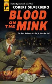
His women weren’t helpless bimbos waiting to be rescued. They were usually the most powerful thing in the room. They had secrets, leverage, motives. You didn’t want to mess with them—but you’d probably try anyway. Because McGinnis knew how to paint allure. He wasn’t just drawing pretty faces—he was drawing stories in mid-seduction.
And more often than not, the men on his covers looked like they already knew they were in trouble. There’s something about the body language—a slack jaw, a raised collar, a gun that’s just a second too slow—that says it all: she’s got you.
You know the look even if you don’t know the name. A woman in a satin dress leans against a crumbling brick wall, cigarette poised, danger curling in the smoke. A trenchcoated man lurks in the shadows, one hand on a gun and the other on a lie. Neon signs reflect off wet pavement like it’s always just rained. Welcome to McGinnis country.
Robert McGinnis didn’t invent the paperback cover. He just perfected it. And in my opinion, it’s a shame things ended the way they did. As a fan of crime fiction, I can’t even begin to tell you how sick I am of shadowy figures on book covers over the last fifteen years—at least.
Do a search yourself. Type in Jack Reacher book covers and (aside from the first few which now feature whoever the guy is who plays him on TV), you’ll find a shadowy figure. Try Rebus covers. Robert Harris. James Patterson. Jo Nesbo. Despite my love for some of these guys, the covers of their books have me falling asleep in my chair before I’ve even started—and it’s not like publishers don’t have the tools. They just seem to view it as a wasted expense.
A stock image will cost you around £3 from any of the main libraries (more if you want to take the license off the shelf), and the typesetting is pretty run-of-the-mill. In short, there’s nothing to write home about. But take a look at some of Hard Case Crime’s cover selection…


These guys can be bothered to do something great, so why not the big guys? I probably shouldn't be surprised. It’s the way that it is everywhere. When was the last time you saw a fantastic album cover from a major label artist? Was it even this century? Anyway…
The Golden Hand Behind the Rack
Born in 1926 in Cincinnati, Ohio, McGinnis was already drawing before most kids could tie their shoes. After a stint in World War II, he studied at the Art Institute of Cincinnati, then went on to refine his craft at the Art Students League in New York. He wasn’t aiming to be a pulp legend - who was! At first, he was just another working artist taking on commercial illustration gigs—magazines, advertising, movie posters. But the call of the paperback was too strong.
His first big break came via a cover for a Mike Shayne novel in 1959. From there, it was like lighting a fuse on a stack of dynamite. Over the next few decades, he painted more than 1,200 paperback covers—and not just for nobodies, either. Donald Westlake, Carter Brown, Erle Stanley Gardner, Brett Halliday, Richard S. Prather… If your name was floating in the smoky atmosphere of crime and mystery fiction in the ’60s and ’70s, chances are you got the McGinnis treatment.
And what a treatment it was:
More Than Just Legs
Let’s address the elephant in the garter belt. McGinnis is often celebrated—but most often dismissed—for his women. Long-legged. Elegant. Dangerous. Yes, they’re sexy. Unapologetically so. But to reduce McGinnis to just a “pin-up guy” is like saying Jimi Hendrix just made noise.
His women weren’t helpless bimbos waiting to be rescued. They were usually the most powerful thing in the room. They had secrets, leverage, motives. You didn’t want to mess with them—but you’d probably try anyway. Because McGinnis knew how to paint allure. He wasn’t just drawing pretty faces—he was drawing stories in mid-seduction.
And more often than not, the men in his covers looked like they already knew they were in trouble. There’s something about the body language—a slack jaw, a raised collar, a gun that’s just a second too slow—that says it all: she’s got you.


The Style That Dripped Off the Page
McGinnis’s style was clean, sleek, and cinematic. His work has that “still frame from a lost film noir” quality. Carefully constructed, beautifully lit, with a keen eye for posture and pose. The backgrounds were often minimal—suggestions of urban decay, shadowy hotel rooms, glowing cityscapes—but they always gave you just enough atmosphere to place the scene.
Color was his weapon of choice. Deep crimsons, velvet blacks, lurid greens. A McGinnis painting didn’t just sit on a shelf—it hummed with tension. The moment before the gunshot. The instant after the kiss. The part of the story where everything was about to go wrong, but hadn’t yet.
They were built with one purpose: to stop you looking away.
Even his James Bond posters—Thunderball, You Only Live Twice, Diamonds Are Forever, Live and Let Die—have that signature cool. The girls are there, of course, but so is that aura of sleek violence and polished seduction. McGinnis made Bond look like Bond before the camera ever rolled.

Paperback Picasso
As previously discussed, it’s easy to forget just how disposable pulp used to be. These weren’t prestige novels. They were sold in supermarkets, train stations, bus depots. Most were read once and tossed, dog-eared and spine-cracked. But the covers lived on. People collected the covers.
There’s a whole subculture of paperback fans who couldn’t tell you what happened in “The Girl in the Red Mist” but remember the pose she struck on the front. That’s the McGinnis effect. He elevated pulp to art. He gave sleaze a touch of class. His paintings had a rhythm, a symmetry. They didn’t just decorate the story—they were the story, boiled down to its purest, most tantalising essence.
Better Than the Words
What most pulp lovers won’t admit is that most of the books he painted covers for weren’t very good. Some were fine. Some were fun. But a lot were just there to hold the pages together long enough for someone to buy it on the strength of the artwork alone. And you know what? That was enough because that was the business they were in.
In fact, McGinnis may be responsible for more disappointed readers than anyone else in publishing. Because how do you live up to that level of promise? That much intrigue? That kind of danger?
You didn’t. But it didn’t matter. The cover was the payoff.
I cannot tell a lie here - 300 issues of my magazine (Skin Deep, if you weren’t paying attention) sold truckloads of copies and I’m pretty sure it was for that very reason because those are the exact rules we played by. How do you stand out on a shelf of hundreds of other magazines? It might not be viewed kindly these days–and truth be told, it caused a lot of hassle–but we all paid our mortgages, people had jobs and I’d like to think what was on the inside was worth it too but that’s not for me to judge. No animals or humans were harmed in the production process.
Legacy of a Lurking Legend
Today, McGinnis’s original paintings go for thousands–I know because I’ve looked and then backed sharply away. Museums exhibit his work. Art books sing his praises. And younger illustrators—if they’re smart—study his use of composition, color, and restraint like gospel. He never overdid it. In a genre that leaned on excess, McGinnis kept it sharp. Precise. Cool as a switchblade in a dinner jacket.
As digital art floods the world, there’s something sacred about a man who used oil and gouache to create mythologies. McGinnis didn’t have Photoshop. He had brushes, canvas, and nerve.
He’s still alive, too—well into his 90s as of this writing. Which means somewhere, out there, is a living bridge to the golden age of pulp. The last of the real ones.
Why It Still Matters (To Me, To You, To the Cult)
Scowling at a McGinnis print I own, is not just nostalgia. It’s permission. His work reminds me that art doesn’t have to be polite to be powerful. That commercial work can still be profound. That lowbrow and highbrow are terms made up by people who don’t understand why a woman holding a pistol in lingerie can be just as poetic as a landscape of haystacks at dusk (but it probably also has something to do with money because it usually does).
Robert McGinnis never asked to be in the canon. He just dedicated his life to it, painted the hell out of it and left the critics to catch up. He knew what we really wanted: seduction, mystery, and that feeling that the night might still have something dangerous up its sleeve.
And in his world, it always did.
If you’ve ever judged a book by its cover—and damn it all, you should because that would change the rules of the game out there—there’s a good chance Robert McGinnis was the man behind your crime.
Here’s to the master. The maestro. The brush-wielding devil who made pulp look like it had a degree in cool.
Long may his dames smoulder and his shadows fall just right.